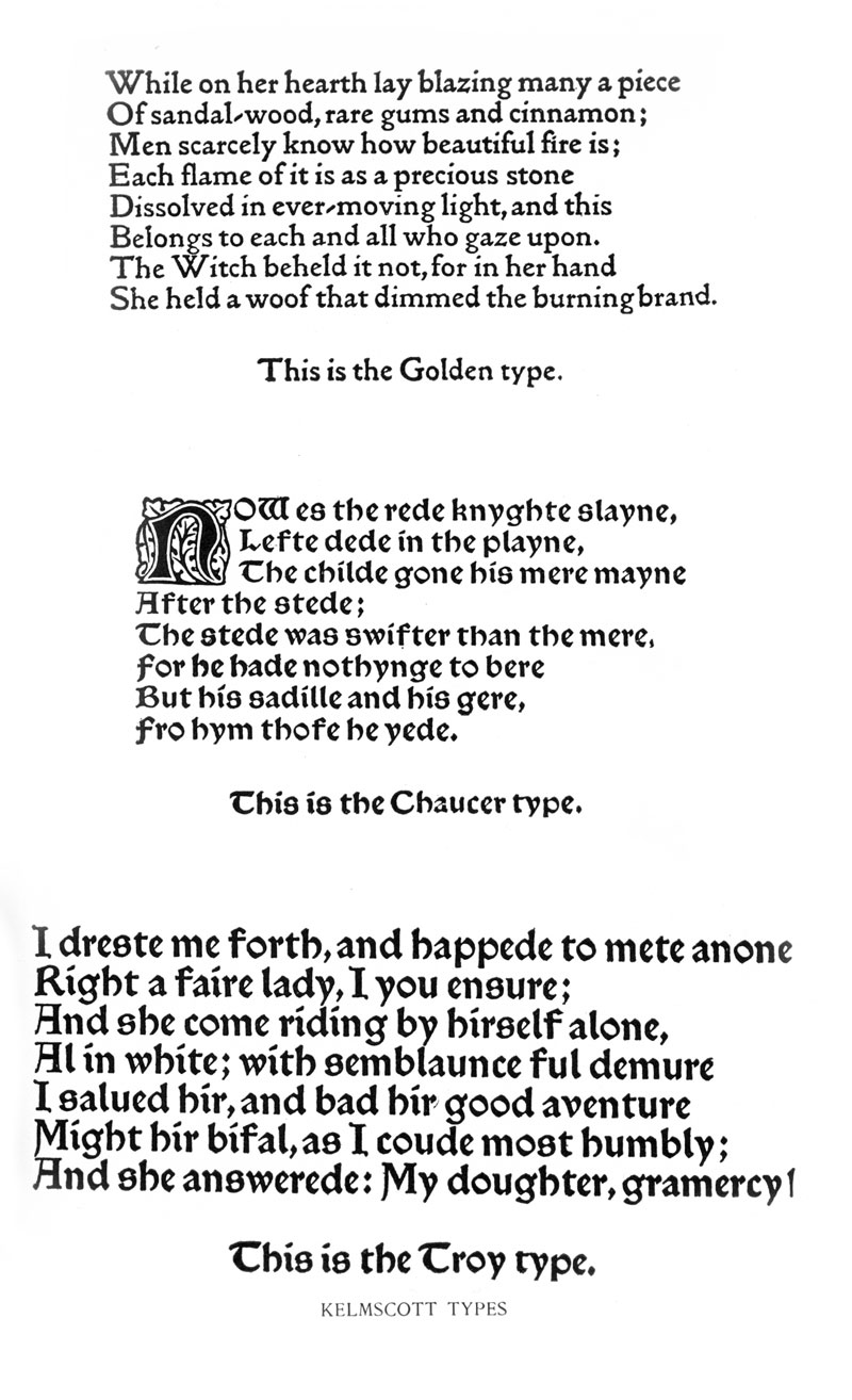
From the holdings of the Archives & Rare Books Library, here are a few typical examples of the ornamentation, layout, style, and type used at the press. Many of the illustration and intricate borders were printed as woodcuts. Morris used only red and black inks and he designed three typefaces for use in the Kelmscott books: Chaucer, Troy, and Golden. All three are largely medieval in style. This look was later imitated by fine presses and commercial printers in England and the United States.

A later printers mark, used on large folio format books 
William Morris’ printers mark, this appeared in nearly all of the books published at Kelmscott 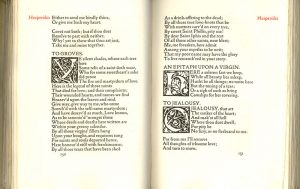
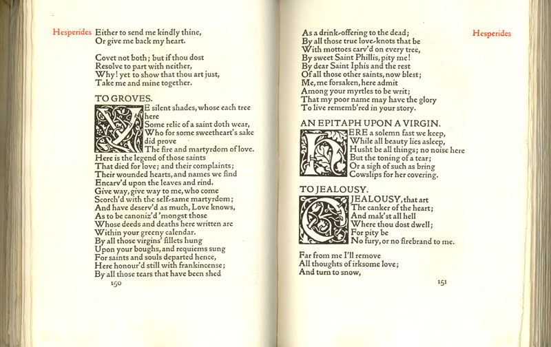
A spread from “Poems Chosen Out of the Works of Robert Herrick 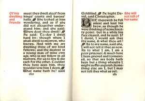
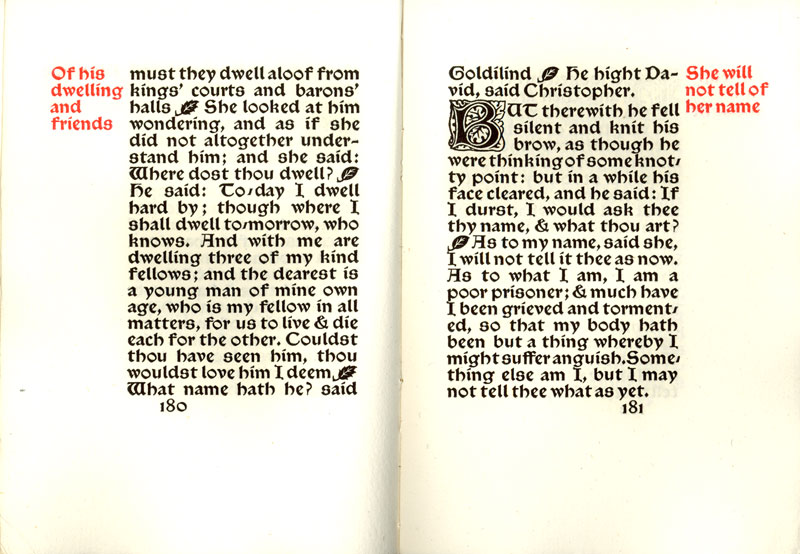
A spread from “Child Christopher and Goldilind the Fair,” Kelmscott Press, 1895 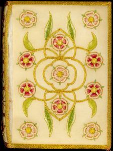
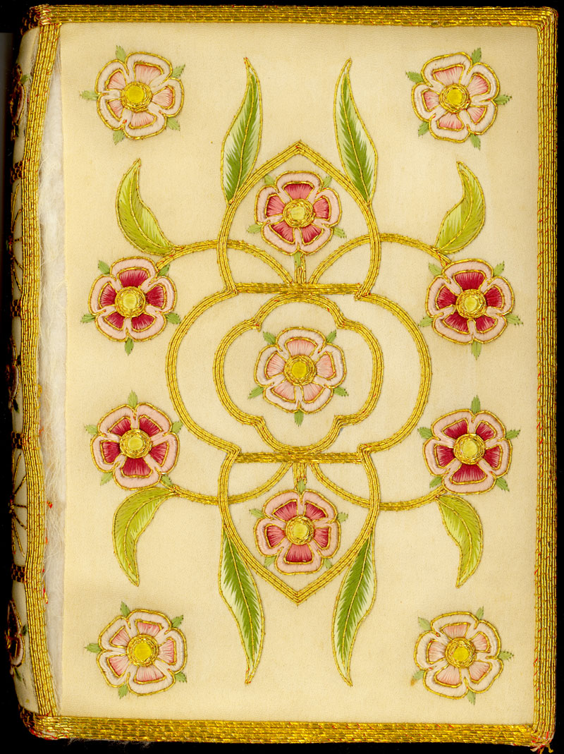
A very rare book in the Archives and Rare Books Library collection. This copy of Sire Degrevaunt has an elaborate embroidered cover. 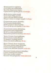
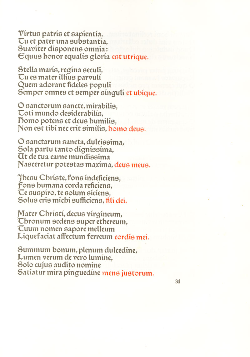
An instance where red is used to provide emphasis on words in the text, instead of only for subtitles and headings. 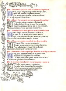
A page from “Laudes Beatae Mariae Virginius” which is very rare among Morris’s works that uses blue ink in addition to the typical black and red. 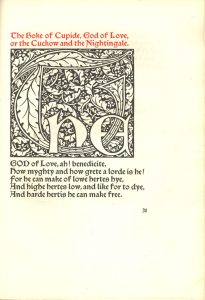
A title page from ‘The Boke of Cupid’ with an exceptionaly large illuminated word – ‘the’ 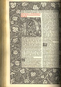
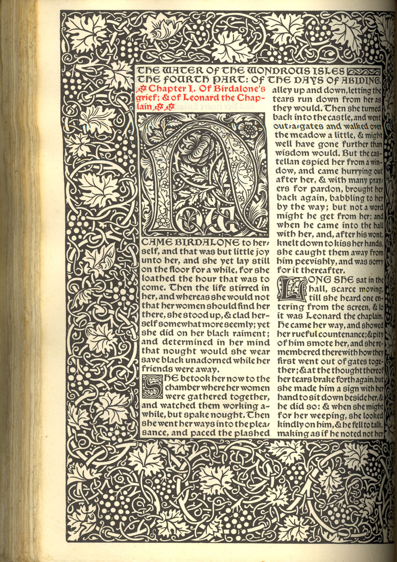
The first page of the Waters of the Wondrous Isles’ 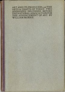
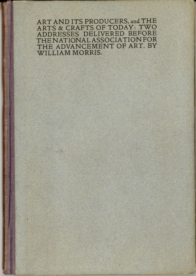
The cover of ‘Art and its Producers, and the Arts & Crafts of Today: Two Addresses Delivered Before the National Association for the Advancement of Art byy William Morris 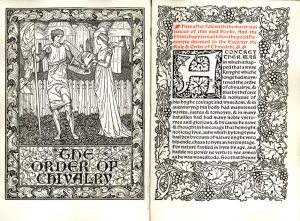
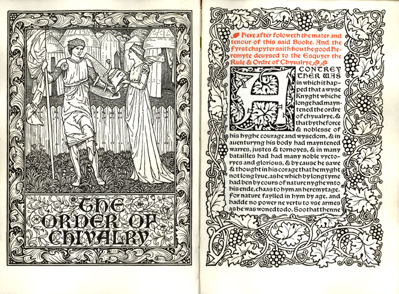
The title spread of ‘The Order of Chivalry’, printed on vellum 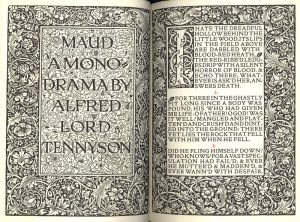
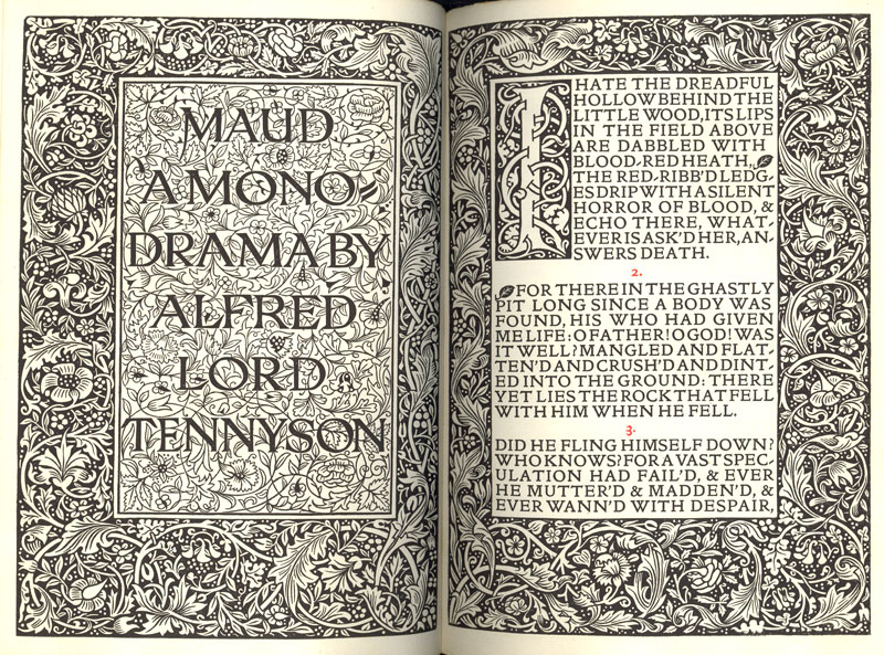
The title page spread from Alfred Lord Tennyson’s ‘Maud’ 
This was the last book printed at the Kelmscott Press, and was sold by the trustees of William Morris 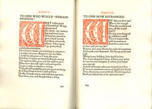
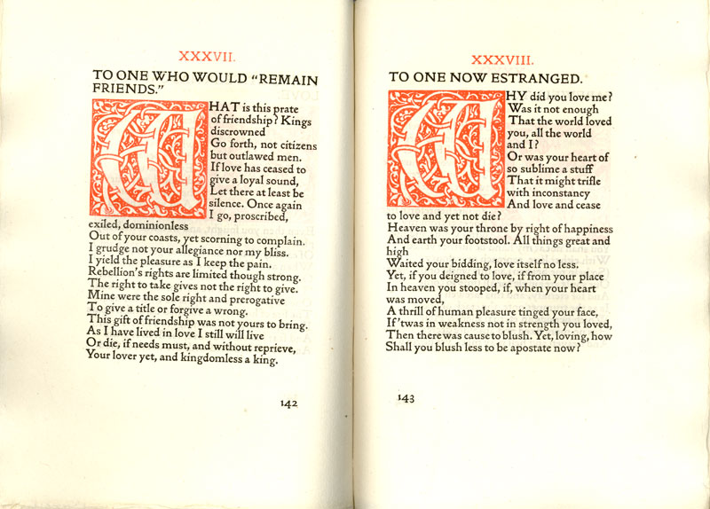
Two poems from ‘The Love-Lyrics and Songs of Proteus’. This layout is rare because it uses red illuminates characters 
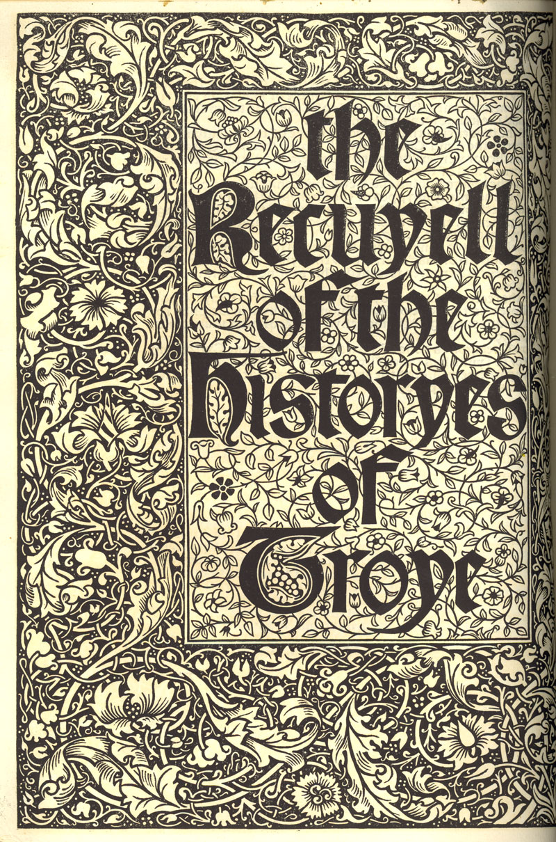
Title page from ‘The Recuyell of the Histories of Troye’ 
Typographic samples of the three fonts William Morris designed and used at Kelmscott 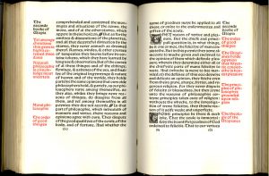
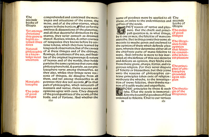
A spread from More’s ‘Utopia’. In this case the red margin notes summarize the corresponding text