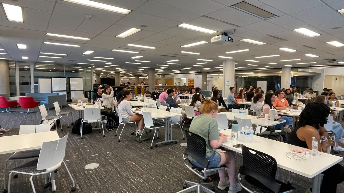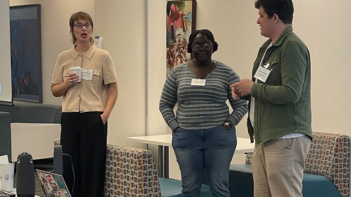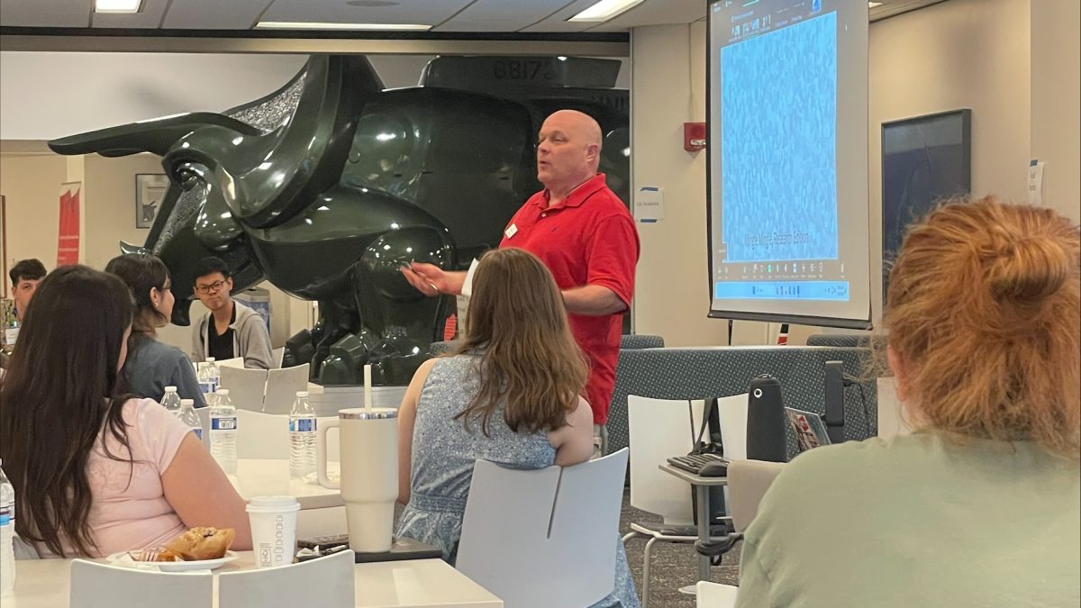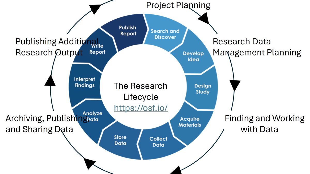
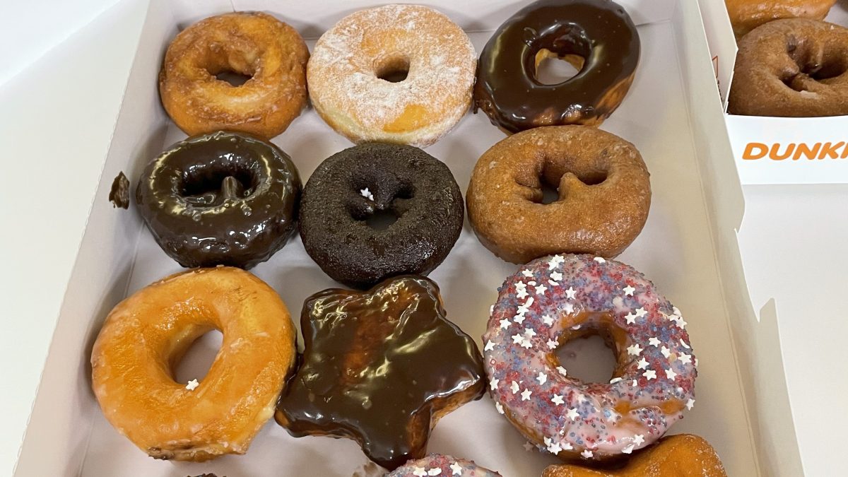
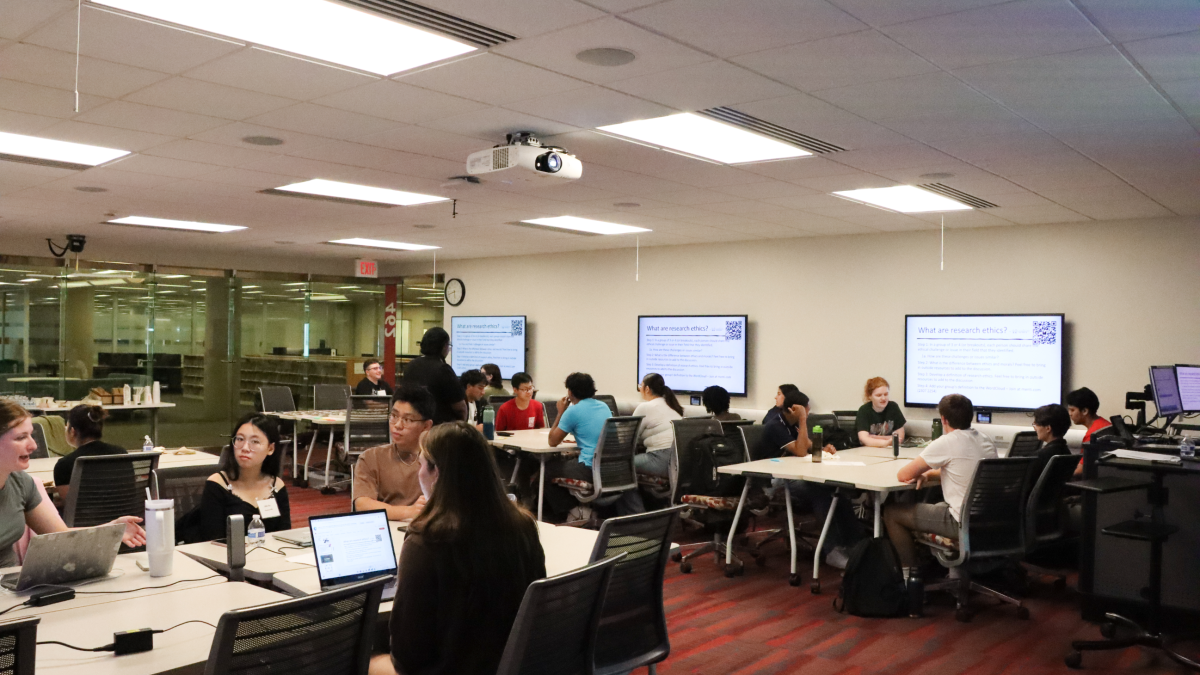
Do you have summer plans yet? We would love for you to join us in the library for research fun and skills. The 2026 Undergraduate Research Summer Learning Community is a great way to learn about research, acquire research skills and meet other undergraduates either interested in or currently doing research. This year the community will run from June 3 to July 22 and meet every Wednesday morning from 9:30 am to 11 am. The first session will include a celebratory meal and networking to kick off the 8 weeks of skills, friends and fun. Each session will be facilitated by a mentor engaged in undergraduate research support and will be offered as both in-person and virtually via zoom. In-person sessions will also have donuts and coffee. The final session will be in-person and feature an Opportunities Fair and more networking time. Attendees of at least 5 sessions will get a digital certificate of attendance which will look great on your LinkedIN profile. You can register and learn more information about the program and weekly topics by visiting the URSLC webpage. Email askdata@uc.edu for more information and if you have any questions.
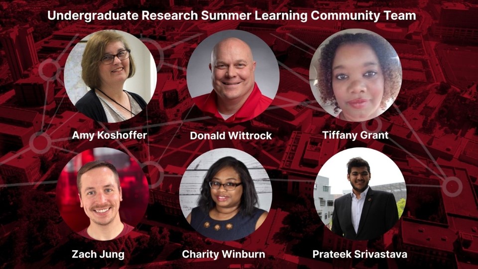
The URSLC is sponsored by UC Libraries and is offered in collaboration with the TRIO McNair Scholars, University Honors Discover program, and the CEAS Office of Professional Development & Community Impact. The program is free and open to any undergraduate (UC and beyond) interested in research.